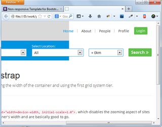
I've just started building a website using bootstrap - non responsive template, and observed that my full width div (one with blue background) not stretching to full browser width when viewed resizing the browser window. Even though I added width: 100%; its making no difference. Please see attached the screngrab.
Also if I removed the 'navbar-fixed-top' class from main navigation, then navigation background also starts behaving in the same manner. Can anyone let me know whats going wrong here.
Note: The same thing happening in bootstrap template too if I add a full width div to any div block with container class.
Update
here is the snippet of html code:
<div class="sub-header"> <!--div with blue background-->
  <div class="container">
    <div class="row">
      <div class="col-md-12">
          ------inner content -----
      </div>
    </div>
  </div>
and CSS code:
.sub-header { background: #0094e0; height: 80px; border-top: 1px solid #0082c5; border-bottom: 1px solid #0082c5; }